SWHR Branding
The Society for Women’s Health Research has a rich legacy as a pioneer in studying sex differences to advocate for women’s health. They needed a brand that represents their strengths as a thought leader and their commitment to improving healthcare. We delivered new messaging and visuals that brought clarity and strength to their mission.


solutions
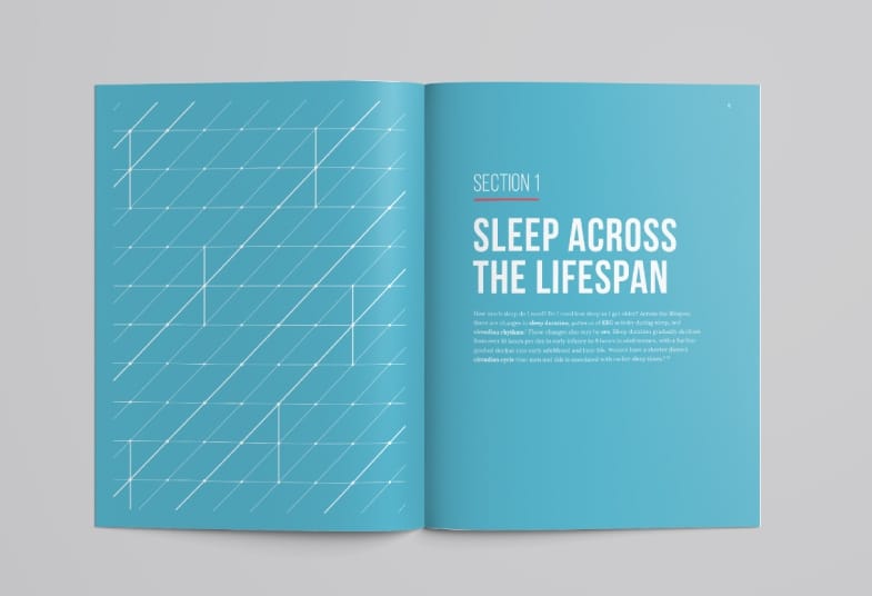
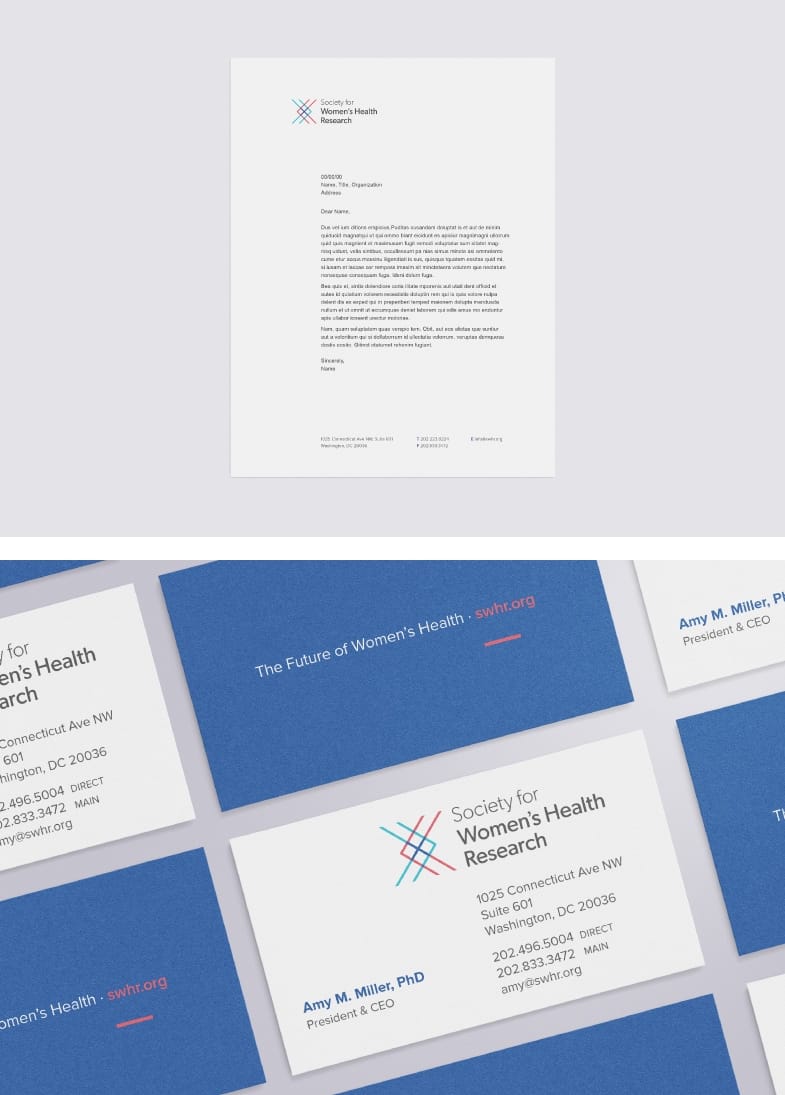
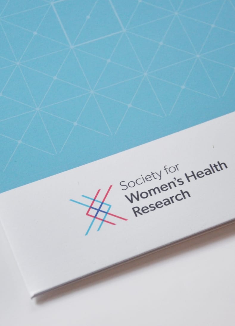
Our foundation for the SWHR logo mark is the XX of the female chromosomes. The overlapping color treatment signifies both the intersection and distinctions between male and female in the field of health. We developed a series of patterns to be used throughout the brand that further express ideas of connection, scientific data, and the pinpointing of differences to find answers.